A Reminder – My User Isn’t Me
Anatomy of Experience
Howard Rose
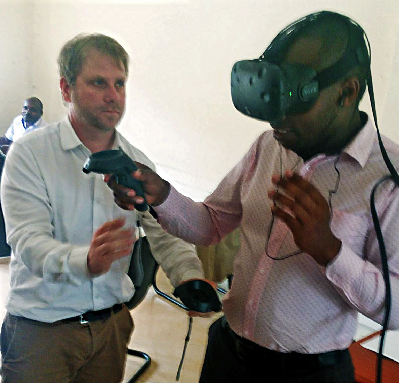
A few years back a friend and collaborator, Torin Lucas, lugged a VR headset and a laptop loaded with Firsthand’s VR pain relief software (Cool!) from England to Uganda, to share the experience of VR pain relief with doctors at Kabale University Med School. For background, Uganda’s population of 46 million is being served by just 40 anesthesiologists. Add on a chronic shortage of meds and supplies and it seems obvious that Uganda could greatly benefit from a scientifically proven, bottomless software analgesic like virtual reality.

Torin Lucas ushers Dr. Henry Bukwira through COOL! at Kabale University Medical School, Uganda.
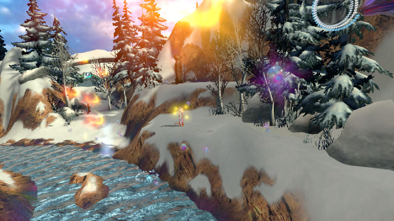
After battling his way through the danger zone of road bandits – for real -between the airport and the university Torin and the VR arrive. Torin eagerly puts Dr. Henry Bukwira in the VR headset and launches COOL!, sending him down a flowing river through a snowy winter landscape where you can play with otters on the river banks. It took Dr. Bukwira a bit of time to acclimate and get into COOL!, but he made it. When he emerged blinking from the headset, the doctor’s smiled saying “I’ve never been in snow before. And what were those animals (otters)?”
Hearing Torin tell it later, the optimist in me first thought “Great, we gave Dr. Bukwira new and exciting experience of snow for the first time. Success!” OK, yes thumbs up on novelty – but when I thought a little deeper I realized that the novel appeal of COOL! being so far out of his personal experience comes at some costs. I think back to all those who experience COOL! And glow about the joyful memories of snowball fights and skiing. Dr. Bukwira didn’t have any associations to make an emotional connection – it was just different.

COOL! VR pain relief winter landscape replete with otters.
As a designer, there’s nothing more gratifying than to hear somebody connected with my design at a deep, emotional level. The balance between novelty and the familiar that plays out in any design is particularly delicate in a totally synthetic virtual world.
I got to pondering what COOL! would look like if it was made by Ugandans? What would the landscape be? What colors would they choose? What would be fun and emotionally connecting for them to do in this virtual space? The deeper I went, the more I came to appreciate the gap between me and the people I design for, even the people in my own country.
How well do we really know each other? Even with the best of intentions applying the standard research methods of focus groups, surveys, live user testing, etc., can we really get to know enough about people’s authentic lives to make the best decisions? The pressures of time and resources mean we most often settle for our own interpretation of what’s good, or at least good enough.
I offer 4 takeaways from this experience to design more successfully for diversity:
1. Design and product teams need to start mirroring the people we are building products for. Expanding diversity of race, gender, culture, life experience is essential.
2. Embrace complexity. Big news: People are complex! Build to fit their world – don’t just bring Silicon Valley to them.
3. Everybody has their own stories of themselves, others and how the world works. Honor and get inside those stories.
4. Understand and tie into their aspirations – not just your aspirations. Identify leverage points to overcome barriers, conflicts, and self-limitations.
The gaps between designers and the designed-for are especially glaring for traditionally undeserved, marginalized people so often overlooked. But this is more than a plea for design philanthropy. Better attention to the range of human diversity will lead to better products, new markets, and a more level playing field in society. Everybody wins.
© 2021 Howard Rose, all rights reserved


